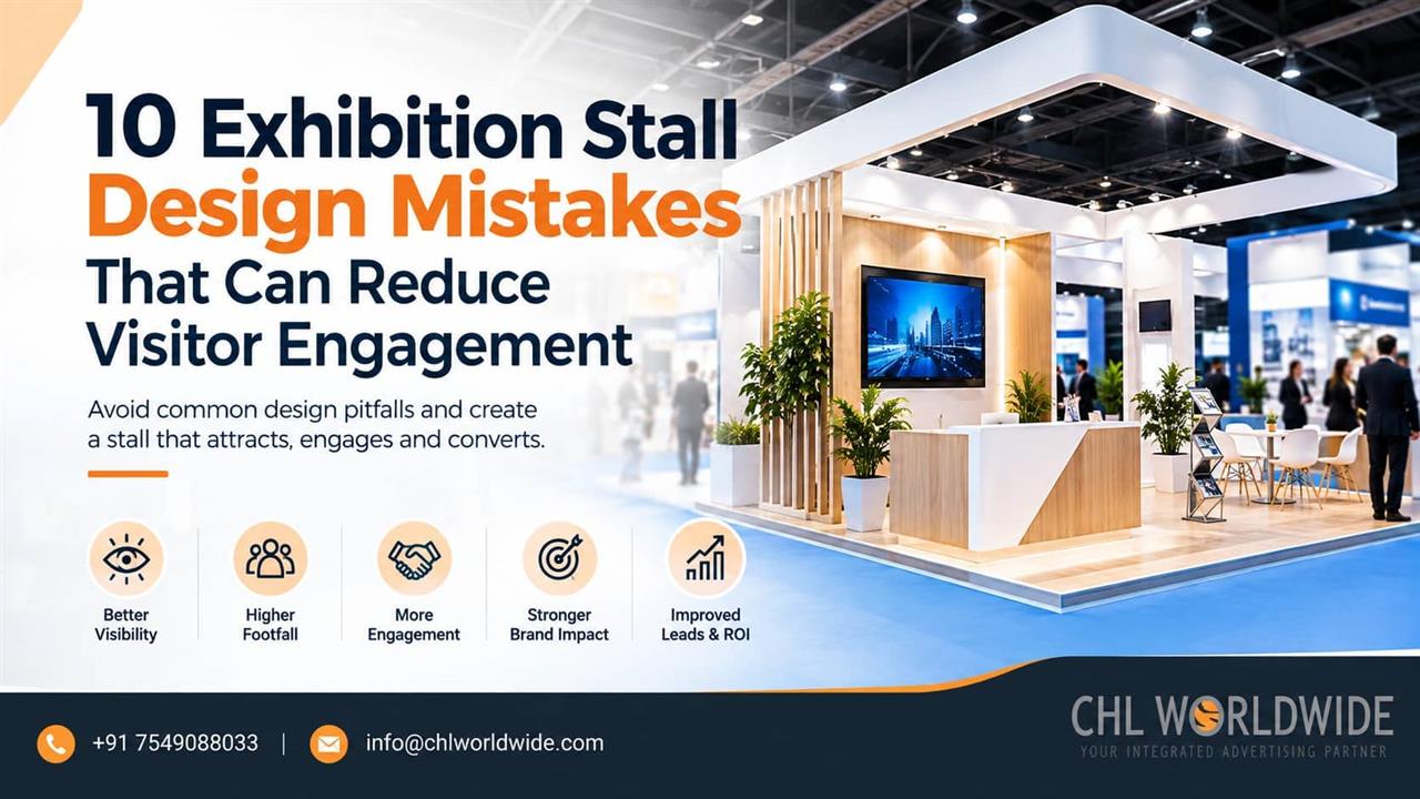
10 Exhibition Stall Design Mistakes Reducing Visitor Engagement

22-Sep-2026
Exhibitions reflect the brand, products and impresses upon the buyer. Whether you call it a stall or a stand, the same exhibition stand design mistakes props up show after show, quietly working against visitor engagement. To stand out, exhibitors either overdo or tone down causing a churn hurting engagement. To provide an experience that drives footfall and impact buying decisions, a perfect balance of design decisions should be made. This piece walks through ten of the most common exhibition stall design mistakes and how to fix each one.
1. Poor Exhibition Stall Layout
A cramped or confusing exhibition stall layout is one of the fastest ways to lose a visitor before they even step in. Layout affects engagement directly because it shapes how comfortable someone feels approaching the space. A layout with clear entry points, open sightlines and a logical arrangement of display areas invites people in rather than making them guess.
This is one of the exhibition booth design mistakes that costs the most footfall, since visitors decide whether to enter within seconds.
2. Weak or Unclear Branding
Some stalls display a logo and little else, leaving visitors unsure what the company does. Others go the opposite direction, packing so many taglines and visuals onto the walls that no single message stands out. Both versions of exhibition stall branding fail for the same reason: they ask visitors to work too hard to understand the offer.
Strong branding communicates the core message within a glance, well before anyone reads a single line of text.
3. Too Much Information and Visual Clutter
Cramming every product, service and achievement onto the stall walls feels thorough, but it usually backfires. Visitors scanning a busy show floor process information quickly, and a cluttered stall gives them nothing to focus on.
Clutter also undermines the stall's ability to communicate quickly, which matters more at a trade show than almost anywhere else. Prioritizing one or two key messages, supported by simple visuals, usually performs better than trying to say everything at once.
4. Poor Exhibition Stall Visibility
A stall can be well designed and still go unnoticed if it lacks visibility from key vantage points on the show floor.
Visibility starts with height and placement. Tall structural elements, clear signage positioned above eye level and a design that stands apart from immediate neighbours all help a stall register from a distance.
5. Ineffective Exhibition Stall Lighting
Exhibitions are all about experience. Clear Lightning helps the visitors perceive the brand more interactively. Top products should be focused with spotlights crating a space of exclusiveness the product holds.
6. No Clear Visitor Flow
Visitors wanting to visit your stall should be instantly triggered with proper signages and well-planned flow directions.
They should naturally move from an initial point of interest toward deeper engagement, whether that means a product demo, a conversation area or a lead capture point.
7. Ignoring the Target Audience
A stall designed without a clear picture of who will walk the floor often ends up generic. Messaging that works for a distributor audience rarely resonates the same way with end consumers or technical buyers, yet many stalls use the same generic pitch for everyone.
Understanding the target audience shapes tone, visual style and even the physical layout of the space.
8. Lack of Interactive or Engaging Elements
A stall that only displays static banners and printed material gives visitors little reason to linger. Exhibition visitor engagement improves noticeably when a stall gives people something to do, beyond something to simply look at.
A simple product demo, a hands-on display, a short interactive screen or a live demonstration area can all extend the time a visitor spends at the stall, which directly increases the chance of a meaningful conversation.
9. Weak CTA or Lead Capture Process
Plenty of stalls attract visitors and hold good conversations, then lose the value of that interaction because there is no clearly defined next steps.
A clear, low friction exhibition lead capture process, whether through a simple form, a badge scan, a specific CTA or a quick sign-up incentive, should be built into the stall design from the start rather than added as an afterthought.
10. Designing for Appearance Without Considering Functionality
A stall built purely to look impressive in photos can fail badly in practice if it fails to account for how people move, gather and interact within the space.
Functionality and appearance need to work together rather than compete. Every design choice, from furniture placement to material selection, should support how the space will be used during a busy show day, beyond simply how it photographs before the doors open.
How to Avoid Exhibition Stall Design Mistakes
These exhibition stall design tips focus on removing the friction points that stop visitors from engaging in the first place.
- Put yourself in visitors’ shoes and see the pain points a normal visitor will have to bear.
- Be specific, precise and fast to communicate the brand’s positioning.
- Plan lighting in layers, using accent lighting for focal points alongside general lighting for the rest of the space.
- Map the intended visitor flow early, from first glance to deeper engagement to lead capture.
- Build the stall around a specific target audience rather than a generic pitch.
Conclusion
Avoiding exhibition stall design mistakes ultimately comes down to a simple test: does the stall attract attention, communicate quickly and make it easy for visitors to engage? Every layout decision, lighting choice and messaging call should be built around visitor experience and the business objectives behind showing up at the event in the first place. Companies exploring their next exhibition often benefit from working with a team that handles stall design and fabrication end to end. CHL World wide’s exhibition stall design services cover this process from concept through installation, for exhibitors who want the space itself to do more of the work.
FAQs
What are the most common exhibition stall design mistakes?
The most common exhibition stall mistakes include poor layout, cluttered messaging, weak visibility, inconsistent lighting and missing lead capture processes, all of which reduce how effectively a stall engages visitors.
How does exhibition stall layout affect visitor engagement?
Layouts sends clarity signal in minds of visitors. A confused layer irritates and a clear one gives a seamless experience to visit and have conversations about the products.
Why does lighting matter for exhibition stalls?
Lighting helps visors to focus on products demos and creates a visual trigger to look beyond the stalls and focus on buying.
How can exhibitors improve lead capture at exhibitions?
Building a simple, low friction lead capture process directly into the stall design, rather than treating it as an afterthought, helps convert visitor conversations into usable follow up opportunities.
Why do visually attractive stalls sometimes fail to engage visitors?
Visually attractive stalls fail because of functionality they lack to offer. Stalls should have a perfect balance of functionality and appearance to woo visitors.
LATEST ITEMS
OUR FAVORITES

30-june-2022
29-june-2022